

What if your emails, landing pages, and help articles sounded like three different companies?
Readers notice, and that erodes trust and slows growth.
A content style guide fixes that by giving every writer a single rulebook for voice, tone, grammar, and branded terms.
This post shows why a guide matters, how it differs from a visual brand guide, and a practical 12-step method to build one your team will actually use.
You’ll also get templates, clear examples, and simple rules to speed onboarding, cut editing time, and improve AI output as you scale.
What is a Content Style Guide and Why Does It Matter

A content style guide is your central document for how your organization writes and presents content. It covers grammar, punctuation, branded terms, tone shifts, formatting rules, and visual elements like images and typography. It’s the single reference point for anyone creating content under your brand name—emails, help docs, social posts, landing pages, all of it.
The purpose? Consistency builds trust. When your landing page reads like one person wrote it, your support emails like another, and your social posts like a third, people notice. A style guide keeps every piece reinforcing the same personality, using the same voice, following the same standards. Doesn’t matter who writes it or where it shows up.
A content style guide isn’t the same as a visual brand guide. Visual guides handle logos, colors, fonts, design assets. Content guides handle words—how you write them, what you say, how you adapt across channels. Both matter. Both should exist. But they do different jobs. Your visual guide tells designers which blue to use. Your content guide tells writers whether it’s “sign up” or “sign-up.”
Most companies figure out they need one when they start scaling. One writer can stay consistent by feel. Five writers can align with check-ins. But ten writers, three agencies, a support team, sales reps drafting emails, HR writing internal updates? Inconsistency creeps in fast. The guide keeps everyone aligned without constant editing.
Small teams benefit too. It speeds onboarding, cuts down editing loops, makes handoffs easier. And it makes AI-generated content more useful—feed a clear style guide into a writing tool and the output starts closer to your voice with less cleanup.
Treat the guide like a living document. Language shifts, products change, new channels emerge, audience expectations evolve. Plan to revisit it regularly. It’s a collaborative tool, not a rigid rulebook.
Content Style Guide vs. Brand Guide

A brand guide and a content style guide do different things. Mixing them up creates confusion. A brand guide (sometimes called a visual identity guide or brand book) covers the visual and strategic stuff: logo usage, color codes, fonts, imagery style, brand positioning, mission, values. It answers “What does our brand look like?” and “What do we stand for?”
A content style guide answers “How do we write?” and “How do we sound?” It documents voice, tone, grammar, punctuation, capitalization, preferred terms, formatting rules. It might touch on SEO basics, image sourcing, alt text, but the focus stays on the written word and how language reinforces identity.
The two should work together. Your brand guide might say your personality is “approachable and innovative.” Your content guide translates that into writing rules: use contractions, stick with active voice, skip jargon, lead with benefits, keep sentences under 25 words when you can.
Some organizations combine both into one master guide with separate sections. That works if it’s organized well and easy to navigate. But as content scales, a standalone content style guide becomes essential. Writers need fast access to grammar rules, tricky word lists, tone examples. They shouldn’t have to scroll through logo specs and color palettes.
Keep your content guide focused. If you’re documenting detailed workflows, content calendars, approval processes, move those to a separate operations playbook. If you’re adding visual specs—image dimensions, file types, design templates—move those to the visual guide. The content guide stays lean, practical, centered on writing.
How to Create a Writing Style Guide: 12 Recommended Steps

1. Use a Style Guide Template
Start with a template. Building from scratch is a big project, and a template keeps you from missing critical sections. A good one includes placeholders for voice and tone definitions, grammar and punctuation rules, capitalization standards, formatting preferences, a glossary of tricky words, SEO basics, concrete examples.
Templates also speed adoption. When your guide is well structured and scannable, writers actually use it. Look for templates with example sections you can adapt, side-by-side “do this / not that” comparisons, checklists for each component.
Many templates are free. Download one, customize it to your brand, use it as your skeleton. You can always expand later, but starting with a framework keeps things manageable and covers the essentials.
2. Review Brand Mission and Values
Before writing a single rule, go back to your brand mission, values, positioning. These strategic pieces inform every choice in your guide. If your mission emphasizes simplicity, your writing should be clear and jargon-free. If your values include transparency, your tone should be candid and straightforward, not evasive or overly polished.
Pull language directly from your mission and values and weave it into your content principles. For example, if one value is “empower customers,” a matching content principle might be “Write to help, not to impress—clarity and usefulness over clever phrasing.”
This step also gets leadership buy-in. When your guide roots itself in brand strategy, it’s easier to get executive support and avoid pushback during rollout.
3. Create Buyer Personas
Your guide should reflect how you talk to your audience, and that starts with knowing who they are. Build simplified buyer personas with the minimum info content creators need: short description, brand solutions that matter to them, preferred tone, sample phrasing, key pain points, communication preferences.
You don’t need exhaustive personas with job titles, hobbies, fictional backstories. Focus on details that affect writing choices. If one persona is a busy executive who wants concise, data-driven content, your guide should include tone and formatting tips for that audience: lead with the conclusion, use bullets, keep paragraphs short, skip storytelling that buries the point.
If you serve multiple audiences—say, end users and IT decision-makers—document how tone and terminology shift between them. End users might need simple explanations and reassurance. IT buyers might expect technical precision and ROI data. Your guide should give clear direction for each.
Keep personas accessible. Reference them in your tone section, link to them in examples, remind writers to pick the right persona before drafting.
4. Define Voice and Tone
Voice is your brand’s stable personality—how you sound across all channels. Tone is how that voice adapts to different situations, audiences, channels. Your voice might be “smart, approachable, empathetic,” but tone will shift from playful on social to reassuring in a support email to authoritative in a whitepaper.
Start by choosing four to six defining traits for your brand voice. Use human characteristics writers can picture. “Professional” is too vague. “Confident but not arrogant” gives clear direction. “Helpful but not patronizing” sets boundaries. “Conversational but not sloppy” defines the balance.
Then define a range of six to ten tones your brand might use, depending on context. Common variations include enthusiastic, neutral, empathetic, urgent, playful, formal, reassuring. For each tone, provide guardrails. For example, “Empathetic, but not overly emotional” or “Playful, but not distracting.”
Support every definition with concrete examples. Show a sentence written in each tone. Create “say this / not that” comparisons so writers see the difference in action.
One effective model starts with over 100 tone descriptors, then distills them into nine core tones across three categories. Another approach uses four tone dimensions: formal vs. casual, serious vs. funny, respectful vs. irreverent, matter-of-fact vs. enthusiastic. Pick a framework that fits your brand and makes sense to your team.
It’s okay to start conservatively. Not every brand should sound like Slack or Mailchimp. If bold, quirky copy doesn’t fit your industry or audience, play it safe initially and evolve as you learn what resonates.
5. Choose a Reference Style Manual
Pick a widely recognized style manual and stick with it. The two most common for business content are the Associated Press (AP) Stylebook and the Chicago Manual of Style. AP is conversational, designed for journalism and online content, generally easier for digital teams. Chicago is more formal, often used in publishing, academia, long-form content.
If your industry has a standard—MLA for humanities, APA for social sciences and some science writing—adopt that and document it clearly. For example, you might follow the Chicago Manual of Style, 16th edition (2010), and note that at the top of your grammar section.
No style manual will fit your brand perfectly. Document your exceptions. NASA, for instance, follows Chicago but makes specific exceptions: capitalize prepositions of five or more letters and capitalize “to” in infinitives, so “To Run” instead of “to run.” These exceptions give your guide personality and flexibility while maintaining a foundation of standard usage.
Keep a running list of conflicts between your chosen manual and your brand preferences. Over time, this becomes a valuable reference and helps new writers understand why certain rules exist.
6. List Troublesome Words and Branded Phrases
Every brand has terms that cause confusion: product names with unusual capitalization, industry jargon with multiple accepted spellings, internal terms that should never appear in customer content, regional spelling variants.
Create a glossary or word list that defines correct usage for each. Include branded terms, product names, job titles, any words where your preference differs from common usage.
Examples of items to document:
on-site (adjective/adverb before a noun) vs. on site (after a noun). “We offer on-site training” vs. “Training is available on site.”
web page (not webpage), website (not web site), email (not e-mail), online (not on-line)
Eastern Time or ET (not EST or EDT, which are seasonal and can confuse readers)
Product names with unconventional casing, like interviewstream’s all-lowercase product names or brand-specific capitalization like MailChimp (now Mailchimp after the 2021 acquisition and rebrand)
Document inclusive language replacements. For example, use blocklist instead of blacklist, allowlist instead of whitelist, first-year student instead of freshman. Provide context for why these choices matter, include examples so writers understand how to apply them.
If your word list grows long, move it to a separate searchable document and link to it from your main guide. Keep the core guide focused on principles and examples. The word list can be a reference appendix.
7. Establish Graphic and Image Guidelines
Images, screenshots, videos, infographics are part of your content, and your style guide should include basic rules for using them consistently.
Document the minimum elements:
Image sources and attribution: Are stock photos allowed? Do you require original photography? Must images be credited, and if so, how?
Images per post or page: Set a general guideline (e.g., one hero image plus one supporting image per 800 words) to avoid clutter.
Alt text requirements: Require descriptive alt text for accessibility. Provide examples of good alt text—specific, concise, context-appropriate, like “Woman reviewing contract on laptop in bright office” instead of “image12.jpg” or just “woman.”
Preferred sizes and file types: Specify dimensions and formats (e.g., JPEG for photos, PNG for graphics with transparency, max file size 500 KB).
Alignment and placement: Should images be centered, left-aligned, full-width? How much whitespace should surround them?
Video embed policy: Are videos allowed inline, or should they link out? Do they require captions or transcripts?
Screenshots and infographics: Are they encouraged? Who creates them, and what style should they follow?
If your organization has a detailed visual brand guide, link to it and pull out only the image rules content creators need day-to-day. Writers don’t need your brand’s Pantone codes, but they do need to know where to find approved images and how to write alt text.
8. Share Formatting Recommendations
Formatting creates readability and consistency. Document the minimum elements content creators need to know:
Body text preferences: Font (if applicable for web content), size, line spacing, paragraph spacing. For web content, specify whether to use single or double line breaks between paragraphs.
Header levels and casing: How many header levels should writers use (H2, H3, H4)? Should headers be sentence case or title case? Example: “Sentence case looks like this” vs. “Title Case Looks Like This.”
Hyperlink style: Should links open in a new tab or the same window? Should link text be descriptive (“read our privacy policy”) or generic (“click here”)? How should external links be distinguished from internal links?
List punctuation: Should list items end with periods or no punctuation? Should lists use serial commas?
Bold and italic use: When is bold appropriate (key terms, subheadings)? When is italic appropriate (book titles, emphasis)? Avoid overuse. Too much emphasis creates visual noise.
Special characters: Document preferences for ampersands (&), en dashes, em dashes, other symbols. For example, your brand might prefer “and” over “&” in body text.
Header limits: Recommend a maximum number of header levels to keep content scannable. For web articles, stopping at H3 is common. Going deeper than H4 usually signals a structure problem.
Provide visual examples. Show a well-formatted blog post, a bulleted list with correct punctuation, a side-by-side comparison of good vs. cluttered formatting.
9. Describe Basic SEO Requirements
Your style guide doesn’t need to be an SEO manual, but it should include basics so writers understand how to optimize content without compromising readability.
Document these minimum elements:
Target keyword placement: Include the primary keyword in the title, at least one H2, and in alt text for the main image. Use it naturally in the first 100 words.
Header structure: Use headers to organize content logically. H2s for main sections, H3s for subsections. Don’t skip levels (don’t jump from H2 to H4).
Internal and external linking strategy: Recommend a minimum number of internal links per post (e.g., 2–4 links to related content) and external links to reputable sources (1–2 per post). Provide guidance on link density. Avoid cramming too many links into a single paragraph.
General word count ranges: Define minimum word counts by content type. For example, blog posts might target 800–1,500 words, pillar pages 2,000+, product descriptions 150–300 words.
Meta title and description guidance: Provide character limits (titles ~60 characters, descriptions ~155 characters), remind writers to include the target keyword and a clear benefit or call to action.
Frame SEO as a tool for clarity, not a checklist to game. The goal is helping readers find and understand content, not stuffing keywords or manipulating rankings.
10. Recommend Methods to Source Reliable Data
Data adds credibility, but only if it’s trustworthy and properly cited. Include sourcing rules in your guide to ensure writers use reputable, primary sources and avoid recycled statistics from aggregator blogs.
Recommend reliable sources by category:
Primary research and industry reports: Deloitte, Gartner, McKinsey, Boston Consulting Group, Forrester
Government and nonprofit databases: U.S. Census Bureau, World Bank, World Health Organization (WHO), National Institutes of Health (NIH), Pew Research Center
Respected trade and business publications: Harvard Business Review, AdWeek, TechCrunch, industry-specific journals
Explicitly disallow:
Aggregator blogs with no clear citations: Roundup posts that quote other roundups without linking to the original study
LinkedIn posts with no sources: Personal opinions or unsourced claims, even from industry leaders
Undated or sketchy statistics: Any stat without a publication date, methodology, credible author
Require writers to cite sources in a consistent format. Link to the original report or study, not to a secondary article. If a statistic is older than two years, flag it for review. Data ages quickly in fast-moving industries.
Teach writers to evaluate sources. Ask: Who conducted the research? What was the sample size? When was it published? Is there a clear methodology? If the answer to any of these is unclear, find a better source.
11. Outline Prohibited Topics
Some topics are off-limits for your brand, and your guide should make those boundaries explicit. Define prohibited areas and provide an exception request process for edge cases.
Common categories to address:
Politics: Avoid taking political stances unless politics is core to your brand mission. If you do engage, require executive approval and expert review.
Religion: Generally avoid religious content unless your brand serves a faith-based audience. If you reference religion, ensure it’s inclusive and respectful.
Legal advice: Never offer legal guidance without counsel review. Provide general information only, include a disclaimer when appropriate.
Controversial topics without expert input: Topics like medical advice, financial guidance, safety instructions require subject-matter expert review before publication.
Competitor disparagement: Define whether comparative content is allowed and under what conditions. Avoid negative language about competitors. Focus on your strengths.
Include an exception request process. If a writer believes a topic is important but falls into a restricted category, outline the steps: draft a proposal, get stakeholder input, require legal or expert review, obtain final approval from a designated owner.
Document why these boundaries exist. When writers understand the reasoning—legal risk, brand reputation, audience expectations—they’re more likely to respect the rules and escalate appropriately.
12. Provide Concrete Examples
Examples are the most impactful section of your style guide. Rules are abstract. Examples show writers exactly what to do and what to avoid. Include as many side-by-side “do this / not that” comparisons as possible, covering voice, tone, grammar, punctuation, formatting, channel-specific scenarios.
Example categories to include:
Voice and tone examples
Do: “We’re here to help you get started. Let us know if you have questions.”
Not: “Please contact our support team if you require assistance with onboarding procedures.”
Grammar examples
Active voice (preferred): “Marti logged into the account.”
Passive voice (avoid when clarity matters): “The account was logged into by Marti.”
Passive voice (acceptable to emphasize action): “Your account was flagged by our Abuse team.”
Punctuation examples
Serial comma (standardized): “We offer email, social media, and content marketing services.” (Google-style example)
Without serial comma: “We offer email, social media and content marketing services.” (can create ambiguity)
Capitalization examples
Proper nouns and formal titles before names: “Chief Marketing Officer Jane Doe attended the meeting.”
Lowercase when standalone: “Jane Doe, the chief marketing officer, attended the meeting.”
Channel-specific tone examples
Landing page (formal, benefit-driven): “Increase conversions with personalized email campaigns that reach customers at the right time.”
Social media (casual, engaging): “Your customers want to hear from you. Make it count with emails that feel personal.”
UI text examples
Empty state (helpful, next-step focused): “No projects yet. Create your first project to get started.”
Error message (clear, actionable): “We couldn’t process your payment. Check your card details and try again.”
Include visual mockups when helpful. Show a properly formatted blog post, a well-structured email, a screenshot of good alt text in action.
Create a simple editorial flow example to show the journey from assignment to publication:
| Step | Owner | Action |
|---|---|---|
| Assignment | Content manager | Create brief with target keyword, audience, and key points |
| Draft | Writer | Write article following style guide; include internal links and sources |
| Edit | Editor | Review for voice, tone, clarity, and style guide compliance |
| Final review | Content manager | Check formatting, SEO, and images; approve for publish |
| Publish | Content manager or writer | Upload to CMS, add meta data, schedule or publish live |
The more examples you provide, the easier your guide is to use. Writers won’t need to interpret abstract rules. They’ll see what good looks like and replicate it.
What to Include vs. What to Leave Out

A content style guide should be comprehensive but focused. Include everything writers need to create consistent, on-brand content. Leave out operational details, extensive visual specs, deep training content that belong in other documents.
Include:
Voice and tone definitions with examples
Preferred style manual and documented exceptions
Grammar, punctuation, formatting rules
Capitalization and spelling preferences
Glossary of troublesome words, branded terms, acronyms
Basic SEO guidance (keyword placement, linking, meta data)
Image and graphic guidelines (sourcing, alt text, file types)
Data sourcing rules and recommended sources
Prohibited topics and exception request process
Channel-specific tone and formatting guidance
Concrete examples and “do this / not that” comparisons
Leave out or move to separate documents:
Detailed content operations: Editorial calendars, approval workflows, content planning processes, project management tools belong in a content operations playbook, not the style guide.
Extensive visual and brand specifications: Logo usage, color codes (Pantone, HEX, RGB), typography specimens, design templates, mockups belong in a visual brand guide. Link to it from your content guide, but don’t duplicate it.
Deep training materials: Onboarding decks, how-to videos, writing workshops, skill-building resources should live in a training hub. Your style guide can link to these, but it shouldn’t house them.
Large word lists: If your glossary grows to hundreds of terms, move it to a searchable appendix or separate document. Keep the core guide scannable.
The goal is clarity and usability. If a writer opens your guide looking for the serial comma rule, they should find it in seconds, not scroll through pages of workflow diagrams and logo specs.
How to Encourage Adoption

A style guide only works if people use it. Adoption requires early involvement, easy access, ongoing maintenance.
Involve stakeholders early. Don’t build the guide in isolation and roll it out as a mandate. Bring writers, editors, designers, team leads into the process. Offer choices: “Should we use the serial comma or not?” or “Which of these three tone examples feels most like us?” When people have input, they’re more invested in following the final guide.
Make the guide easy to access. Centralize it where your team already works. Link to it in onboarding materials, pin it in Slack or Teams, include it in content briefs. If writers have to search for the guide or request access, they won’t use it.
Use a living document platform. Google Docs, Notion, Confluence, or a dedicated style guide tool all work, as long as the platform is accessible, searchable, easy to update. Avoid static PDFs. They’re hard to search and quickly become outdated.
Limit edit access but encourage feedback. Give a small team (content lead, senior editor, brand manager) edit rights to maintain quality and prevent fragmented versions. But create a clear process for suggesting changes—a Slack channel, a form, a comment thread in the guide itself. Review requests regularly and update the guide when changes make sense.
Keep it updated. Set a review cadence (quarterly or twice a year) and assign an owner to ensure updates happen. As products evolve, language shifts, and new channels emerge, your guide should reflect those changes.
Train teams and evangelize. Host workshops to walk through the guide when it launches. Create quick-reference summaries or cheat sheets for common questions. Celebrate good examples of style-guide compliance to reinforce the behavior.
A content style guide is never finished. Treat it as a living system that evolves with your brand, and adoption will follow.
Seven Example Company Style Guides
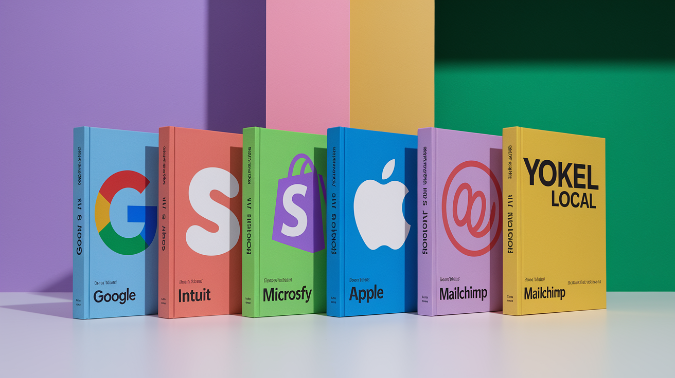
Looking at real-world examples helps you understand what works and sparks ideas for your own guide. Here are seven companies with strong, accessible content style guides.
Google’s developer documentation style guide is public and detailed. It standardizes use of the serial comma, provides extensive punctuation guidance, includes examples for technical writing scenarios. The guide is searchable, well organized, frequently referenced by technical writers across industries.
Intuit
Intuit’s content design guide focuses on clarity and user-first language. It emphasizes writing for non-experts, avoiding jargon, using plain language even when discussing complex financial topics. The guide includes tone variations for different products (QuickBooks, TurboTax, Mint) and provides specific examples for error messages, button labels, help content.
Shopify
Shopify’s Polaris content guide is built for product and marketing teams. It defines voice as “confident, knowledgeable, and supportive” and provides detailed guidance on writing for merchants at different stages of their journey. The guide includes examples for UI text, help documentation, marketing copy, with clear “do this / not that” comparisons.
Microsoft
Microsoft’s style guide is comprehensive and public, covering grammar, punctuation, accessibility, localization, inclusive language. It includes specific rules for writing about technology (how to describe features, when to capitalize product names) and extensive guidance on making content accessible to screen readers and assistive technology.
Apple
Apple’s style guide (portions available through developer resources) emphasizes simplicity and clarity. It defines Apple’s voice as “clear, friendly, and human” and provides strict rules for product naming, capitalization, terminology. The guide is short on fluff and long on specificity. Every rule has a reason.
Mailchimp
Mailchimp’s content style guide is well known for its approachable, conversational tone. The guide includes a “Voice and Tone” section with examples for different scenarios (success messages, error messages, educational content) and emphasizes writing like a human, not a brand. It’s a strong model for companies that want personality without sacrificing clarity. Note that Mailchimp was acquired in 2021, and some branding has evolved, but the core content principles remain influential.
Yokel Local
Yokel Local’s style guide is smaller and more niche, focused on local marketing and SEO content. It provides specific rules for writing location pages, service descriptions, blog posts optimized for local search. The guide is practical, example-heavy, designed for small teams or agencies managing content for multiple clients.
Each of these guides reflects the brand’s personality and audience needs. Study them, borrow what fits, adapt the structure and tone to match your own organization.
Core Components of a Content Style Guide
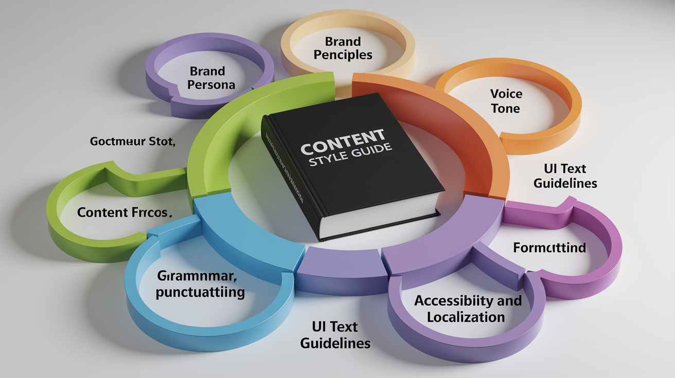
A well-structured content style guide includes several essential components. Each plays a specific role in ensuring consistency, clarity, brand alignment.
Brand Character and Persona
Model your brand as a person. Define human traits and a role—mentor, co-pilot, trusted advisor, enthusiastic coach. This persona sits at the top of the hierarchy and informs every other choice in the guide.
For example, if your brand persona is “a knowledgeable guide who simplifies complex topics,” that translates into writing rules: avoid jargon, use analogies, break down steps, lead with the conclusion.
Place brand characteristics early in the guide. Voice, tone, grammar, examples all flow from this foundation.
Content Principles
Content principles are high-level rules that guide decision-making when the style guide doesn’t cover a specific scenario. Keep them concise. Five principles is a good target. More than that becomes hard to remember.
Use power verbs and aspirational language. Examples:
“Empower customers with clear, actionable information.”
“Simplify the complex. Make every concept accessible.”
“Show respect by being inclusive, transparent, kind.”
“Build trust through accuracy, honesty, consistency.”
“Focus on the user. Write to help, not to impress.”
Content principles set the tone for the entire guide and remind writers why these rules exist.
Voice and Tone
Voice is your stable brand identity. Tone adapts to context. Define voice with four to six human characteristics, and define tone with six to ten variations that reflect different user emotions or scenarios.
Provide guardrails for each characteristic. Examples:
“Smart, but not arrogant”
“Clever, but not patronizing”
“Neutral, but not indifferent”
“Caring, but not affectionate”
“Savvy, but not slick”
Include many examples. Show how voice stays consistent while tone shifts from enthusiastic (product launch email) to empathetic (support response) to authoritative (whitepaper introduction).
One structured method starts with over 100 tone descriptors, distills them into nine core styles, organizes them across three categories. Another uses four tone dimensions: formal vs. casual, serious vs. funny, respectful vs. irreverent, matter-of-fact vs. enthusiastic.
Choose a framework that makes sense to your team, and evolve it as you learn what resonates with your audience.
Grammar, Punctuation, and Formatting
Document nitty-gritty rules that ensure consistency. This section answers practical questions writers face daily.
Grammar:
Prefer active voice: “Marti logged into the account.” Avoid passive when clarity matters: “The account was logged into by Marti.”
Passive voice is acceptable when emphasizing the action: “Your account was flagged by our Abuse team.”
Use contractions to sound conversational: “you’re,” “it’s,” “don’t.”
Keep sentences clear and readable. Target 15–25 words as a guideline, but adjust by context and locale.
Punctuation:
American English uses 14 standard punctuation marks. Punctuation choices change meaning. The classic example: “I’d like to thank my parents, Ayn Rand and God” vs. “I’d like to thank my parents, Ayn Rand, and God.” The serial comma clarifies that the parents are not Ayn Rand and God.
Document your serial comma policy. Google, for example, standardizes use of the serial comma to avoid ambiguity.
Provide examples for tricky punctuation:
Em dashes: Set off a clause or add emphasis.
En dashes: Use for ranges (2020–2025) or connections (New York–London flight).
Exclamation points: Use sparingly. Avoid in formal content and warning messages.
Formatting:
Define header casing: sentence case (“This is sentence case”) or title case (“This Is Title Case”).
Specify how many header levels to allow (typically H2 and H3; avoid going deeper than H4).
Set list punctuation rules: periods at the end of full sentences, no punctuation for short fragments, serial commas in complex lists.
Clarify bold and italic use: bold for key terms and subheadings, italic for book titles and emphasis, but avoid overuse.
Organize this section so writers can scan quickly. Use subheadings, bullets, tables for common rules.
UI Text Guidelines
UI text (labels, buttons, error messages, empty states, notifications) requires context-specific guidance. Include many visual examples because small wording changes have big usability impacts.
Typical UI elements to cover:
Empty states: Be helpful and action-oriented. “No projects yet. Create your first project to get started.” Not: “You have 0 projects.”
Notifications and alerts: Be clear, concise, next-step focused. “We couldn’t process your payment. Check your card details and try again.” Not: “Error 4027: Payment processing failure.”
Radio buttons and checkboxes: Use parallel structure and clear labels. “Email me weekly updates” and “Email me monthly summaries,” not “Weekly updates” and “I want monthly summaries.”
Buttons: Use action verbs. “Save changes,” “Delete account,” “Get started.” Avoid vague labels like “OK” or “Submit.”
Labels and headings: Be descriptive. “Billing address” is clearer than “Address 2.”
Show examples of good and poor UI text side by side. Visual mockups help. Screenshot a well-labeled form or error message and annotate what makes it work.
Usability: Accessibility, Readability, Localization, and Diversity & Inclusion
Usability ensures your content works for everyone, across languages, devices, abilities.
Accessibility:
Include alt-text guidance: write descriptive, specific alt text for every image. “Woman reviewing contract on laptop in bright office” is better than “woman with laptop” or “image12.jpg.”
Document how to write for screen readers: structure content top-down and left-to-right, use proper header hierarchy, don’t rely solely on visual formatting (bold, color) to convey meaning.
Reference WCAG (Web Content Accessibility Guidelines) and recommend testing tools like VoiceOver and JAWS.
Cover acronyms and initialisms: instruct screen readers to read “ID” as “identification” when appropriate, define acronyms on first use.
Readability:
Target clear, readable content. Aim for sentence lengths around 15–25 words as a guideline, but adjust by locale. Some languages and cultures prefer longer, more formal sentences.
Use simple, concrete language. Avoid jargon unless you define it immediately.
Break up long paragraphs. On the web, paragraphs of two to four sentences are easier to scan.
Localization:
Write with translation in mind. Avoid idioms, culturally specific references, humor that doesn’t travel well.
I don’t have the article topic or the primary keyword. Could you tell me the primary keyword (and one short line about the post) so I can write the exact 70–100 word conclusion with the requested H2?
If you prefer, I can write a generic conclusion now using the placeholder phrase “primary keyword” and the H2. Which would you like?
FAQ
Q: What is a content style guide?
A: A content style guide is a set of rules that tells writers how to use tone, grammar, formatting, and brand voice so content stays clear and consistent across channels.
Q: How to write contents in style?
A: Writing content in style means following the guide’s rules for tone, sentence length, word choice, headings, and examples so readers find it useful and easy to scan.
Q: What style guide do most publishers use?
A: Most publishers use either the AP Stylebook for news and general media or the Chicago Manual of Style for books, academic work, and longer pieces.
Q: How would you describe your content style?
A: My content style is clear, calm, and helpful, using short sentences, defined terms, practical examples, and safety-first guidance so readers understand and know what to do next.